Our monthly series asks: How do you bring color into luxury design? Turquoise is surprisingly versatile, writes Jill Krasny
Islamorada, Florida | Ocean Sotheby’s International Realty
Some homes have a way of staying with you while others quickly fade from the mind. Almost always, the design scheme is the influencing factor. Shades of purple and lilac work best in homes with a period feel, as does the color green.
However, turquoise—which our series on color in luxury design turns to next—works in contemporary and traditional spaces alike.
“Turquoise, in many forms, has been used since ancient Egypt, when the mineral was greatly revered for symbolizing joy, fertility and divine protection,” says Patrick O’Donnell, an interior designer and brand ambassador for British paintmaker Farrow & Ball. “It was further used in ceramics, from the outstanding Imam Mosque in Isfahan, Iran, to the Ottoman Empire’s exquisite Iznik pottery.”
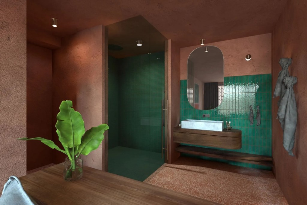
Meganisi, Greece | Greece Sotheby’s International Realty
While turquoise was used as early as 1724 following a recipe for the color Prussian Blue, it was widely deployed in European decorating from around the mid-19th century, says O’Donnell, and its old-world influence can still be felt in Leighton House, the London home and studio of Victorian artist Frederic Leighton. There, the Narcissus Hall is adorned with an elaborate mosaic of turquoise-glazed tiles.
Nowadays turquoise is used in all sorts of ways and tones, says William Cullum, an interior designer based in New York, from upholstery and millwork to objects and tiles. A recent project in Greenwich Village has kitchen and bath walls covered with “fantastic turquoise Moroccan tiles,” he says. And in his own home, garden seats and Victorian majolica add pops of color.
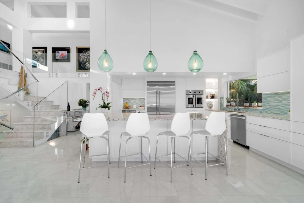
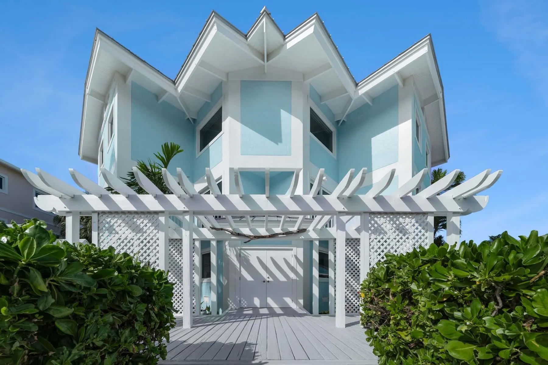
Islamorada, Florida | Ocean Sotheby’s International Realty
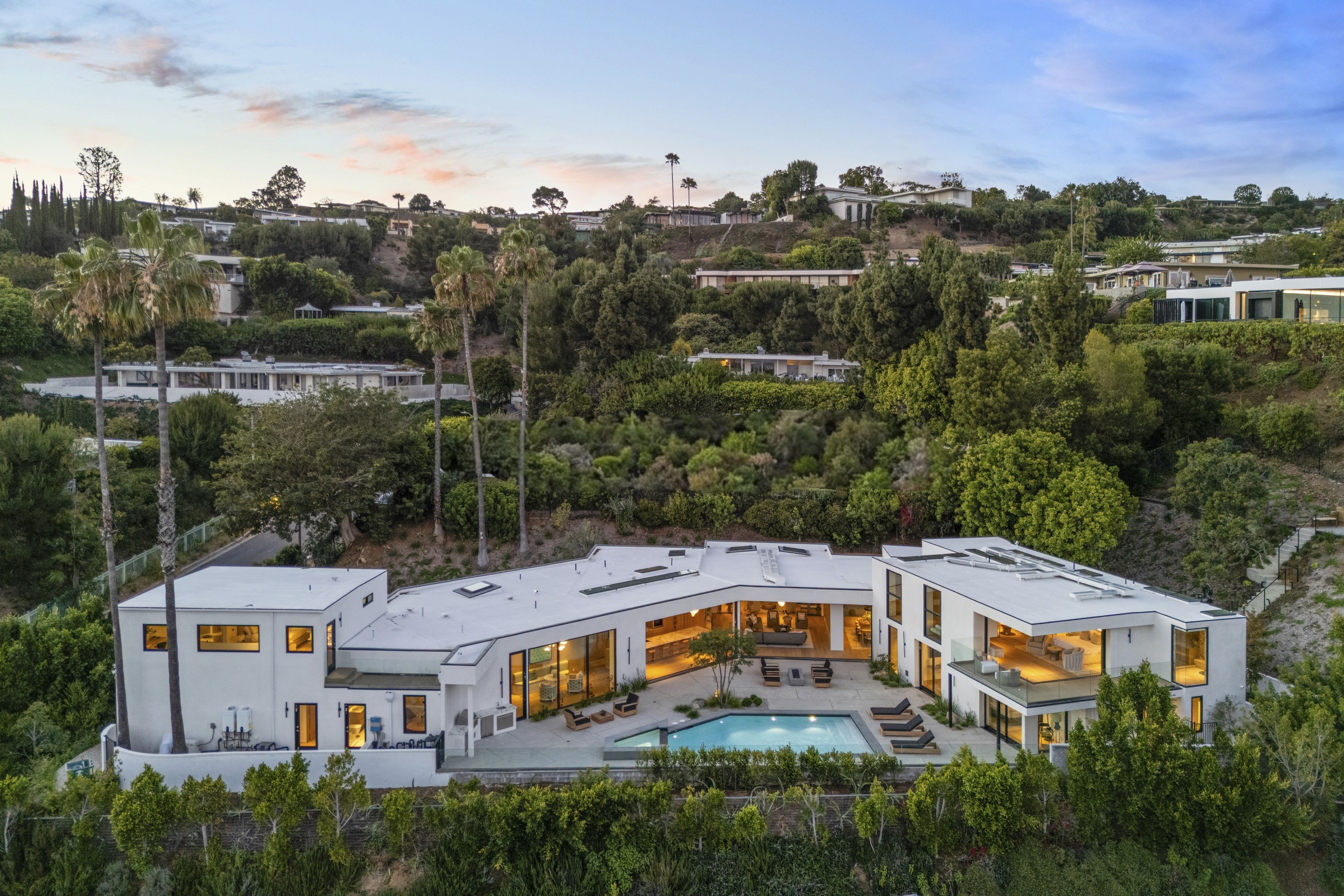
A renovated luxury home in Islamorada, near Miami, Florida, features a pale turquoise exterior that nods to its coastal environment. “It’s a great way of adding personality to the architecture without detracting from the beautiful ocean view,” notes Cullum. The aquamarine glass pendants and tiles in the kitchen also infuse the space with light.
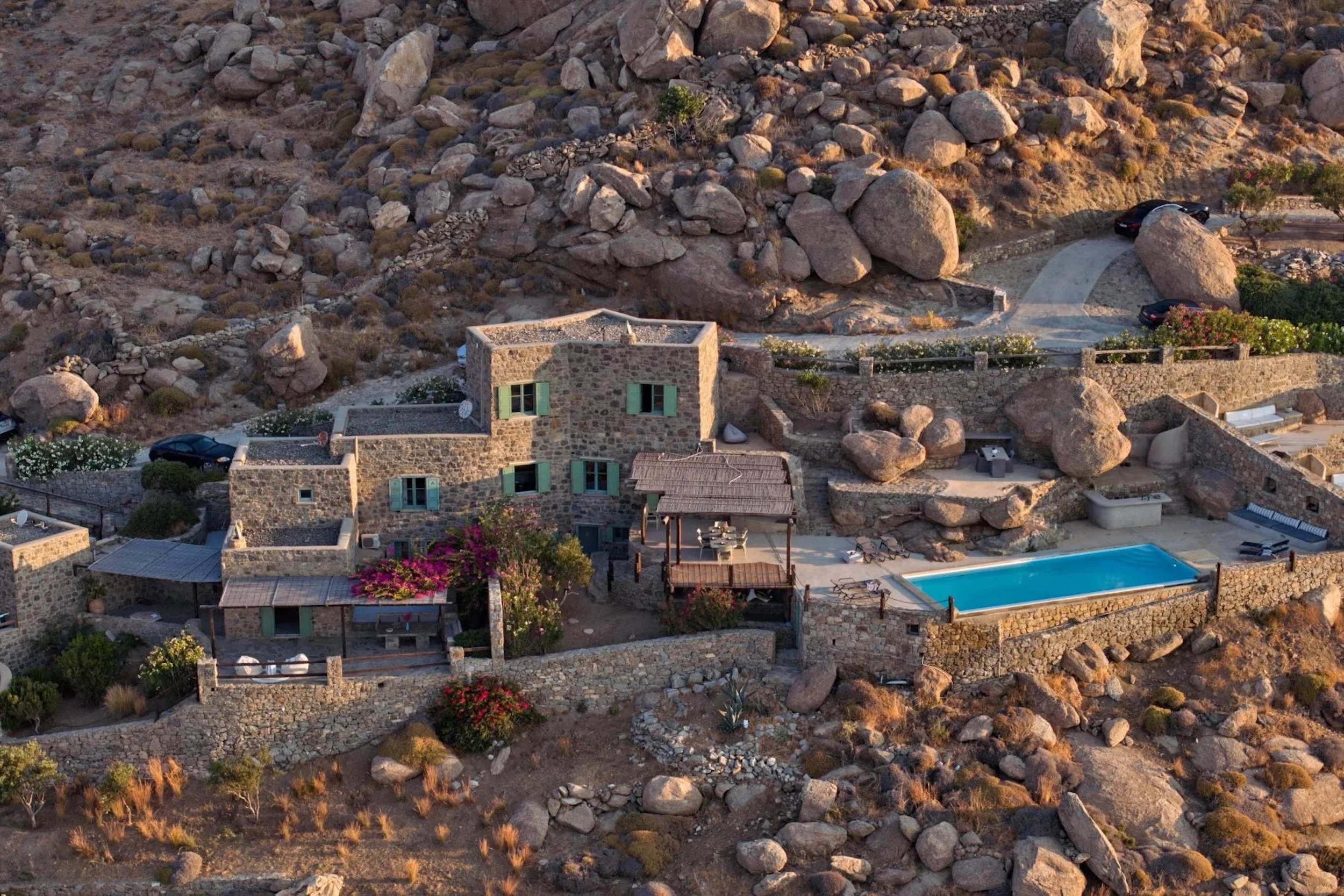
In Eve, a stunning contemporary home on the Greek island of Meganisi, the turquoise-painted en suite bathrooms subtly contrast with the earth tones of the rocky landscape. “The warmth of turquoise plays so nicely with those colors,” says Cullum.
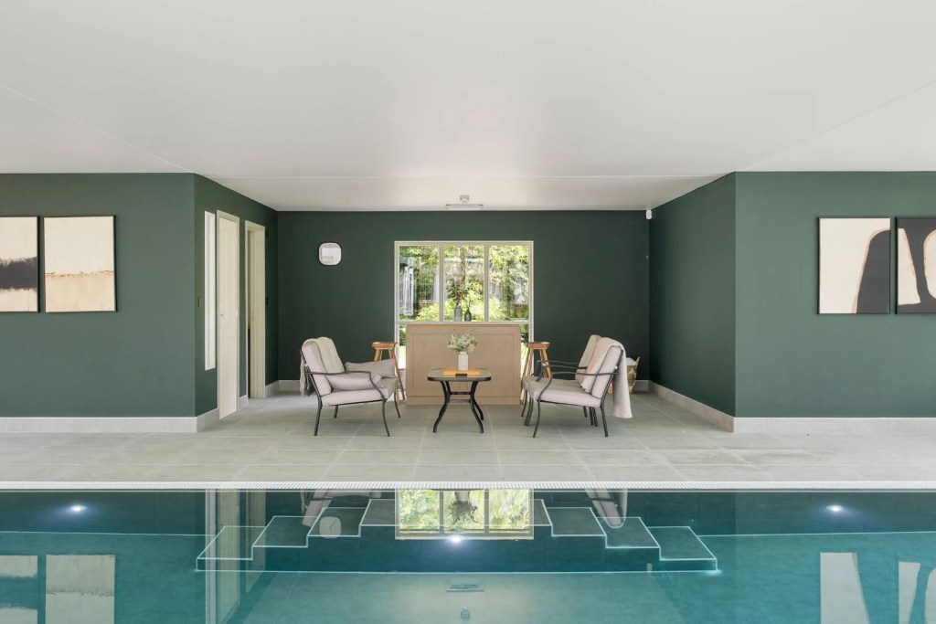
Dorset, England | United Kingdom Sotheby’s International Realty
Earthy cocoa and terracotta colors always look chic with turquoise, says O’Donnell, as evidenced by Egyptian faience, Iznik pottery and Sèvres porcelain. (India yellows and saffron are also safe bets.) And you can dial up and down the shades of aqua.
In England’s picturesque coastal county of Dorset, an impressive country house dating back to the 18th century features a sleek indoor pool set against darker teal walls. In this period property, “a more vibrant version might have felt out of place,” says Cullum. He imagines the room looks as lovely when it’s dreary outside as it does on a sunny day.
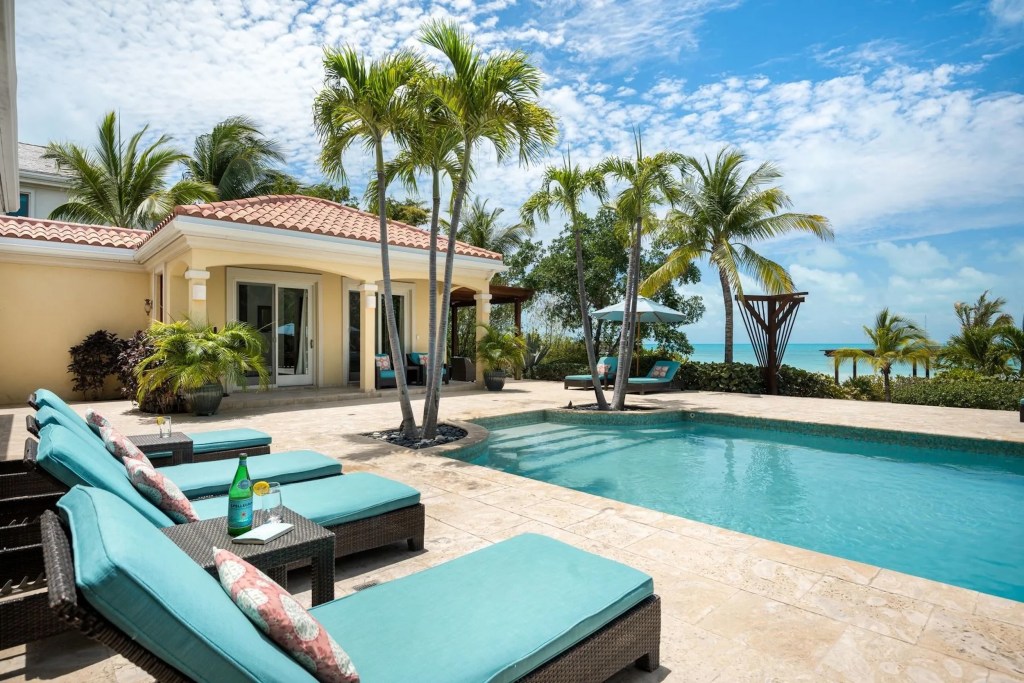
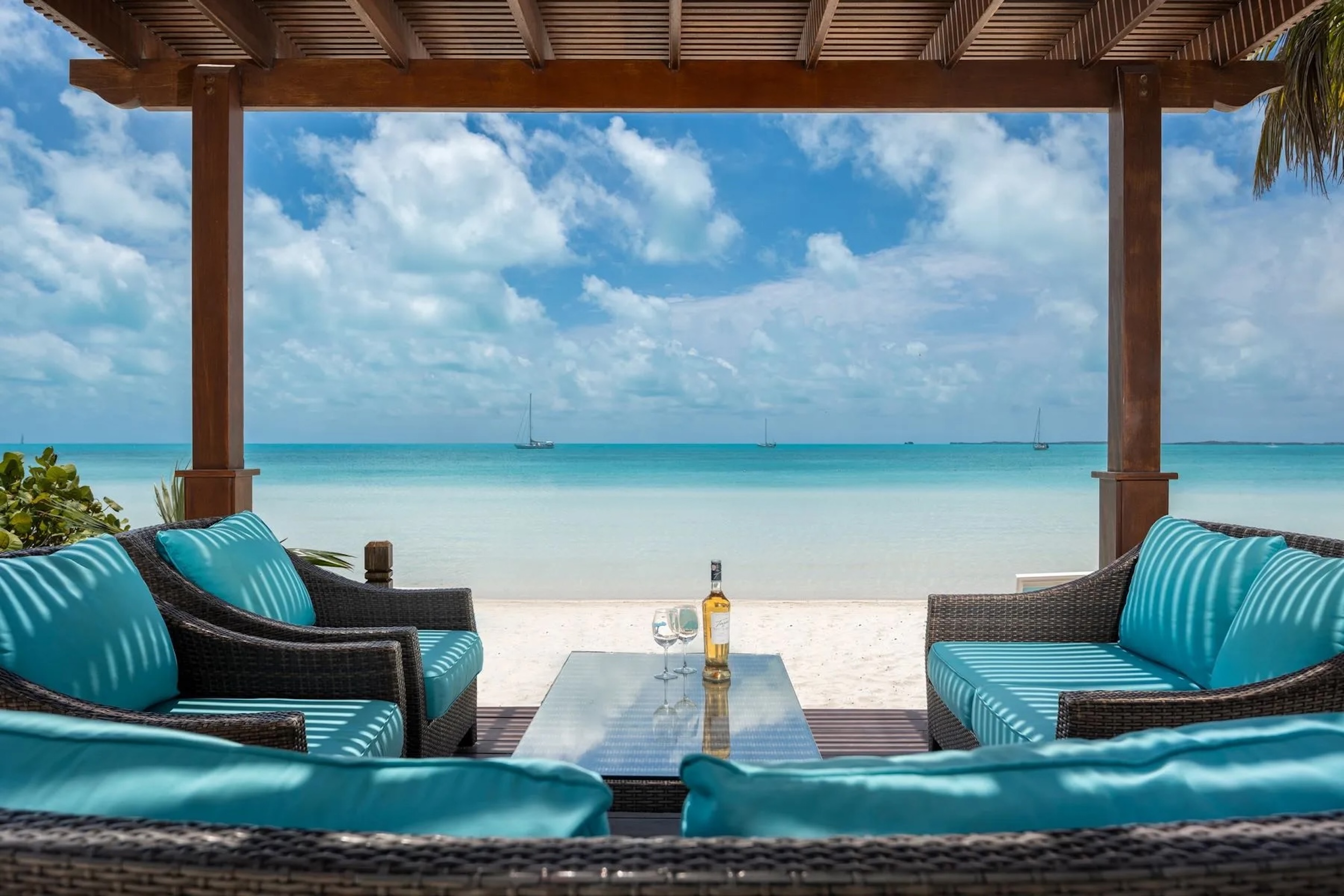
Turks & Caicos Islands | Turks and Caicos Sotheby’s International Realty
Meanwhile, a spacious pool deck at a villa in Turks and Caicos proves turquoise works just as well for soft furnishings as it does for the poolside wall. “When you see the sky and ocean, what other color do you want to see?” says Cullum.
“It feels tropical, has a strong personality and fits into the landscape. With a view like that, you don’t want to detract from it.”
Explore our Color Chart design series, from zingy orange, bold red, joyful pink and natural lilac to classic green, calming white, crowd-pleasing blue and uplifting yellow