Our monthly series asks: How do you bring color into luxury design? Terracotta is warm and grounding, writes Jill Krasny
Cascais, Portugal | Portugal Sotheby’s International Realty
Some homes make a lasting impression while others quickly fade from the mind. Almost always, the design and color scheme is a factor. Green, yellow and lilac all work in homes with a period feel, while turquoise can pop in contemporary and traditional spaces alike.
Terracotta—which our series on color in luxury design turns to next—is similarly versatile, having been deployed in a range of indoor and outdoor spaces for centuries.
“The use of terracotta goes back millennia, originating from the ancient Mediterranean, where it was used particularly for roof decoration and monumental sculpture,” says Joa Studholme, color curator for British paint maker Farrow & Ball. “Its baked-earth color became popular in homes in the 19th century, and now—in our increasingly digital world—it feels warm, comfortable and grounding.”
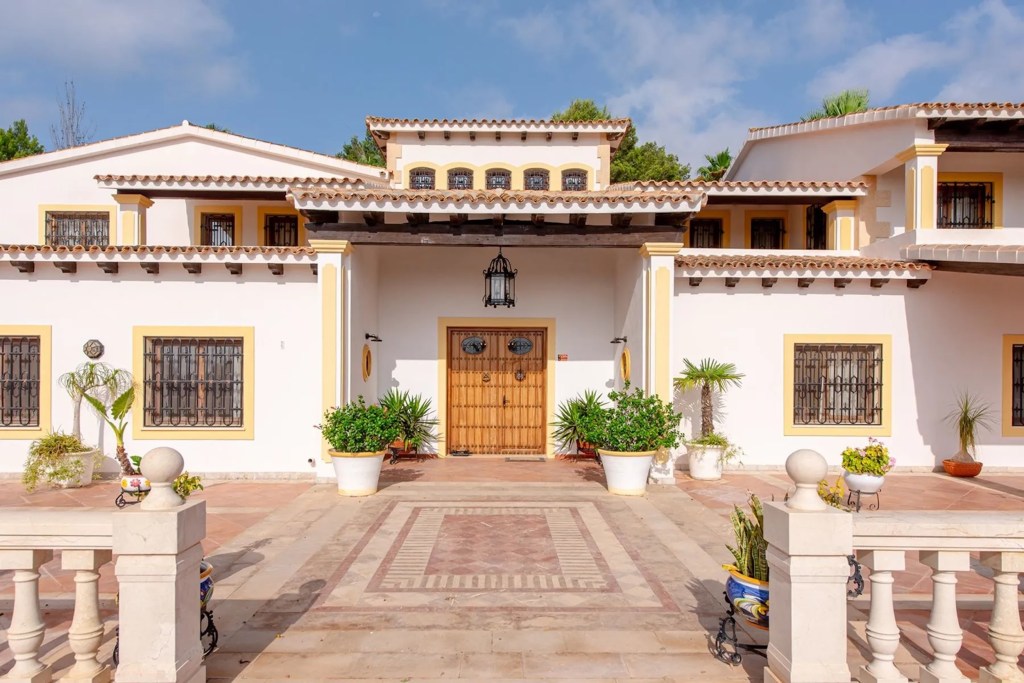
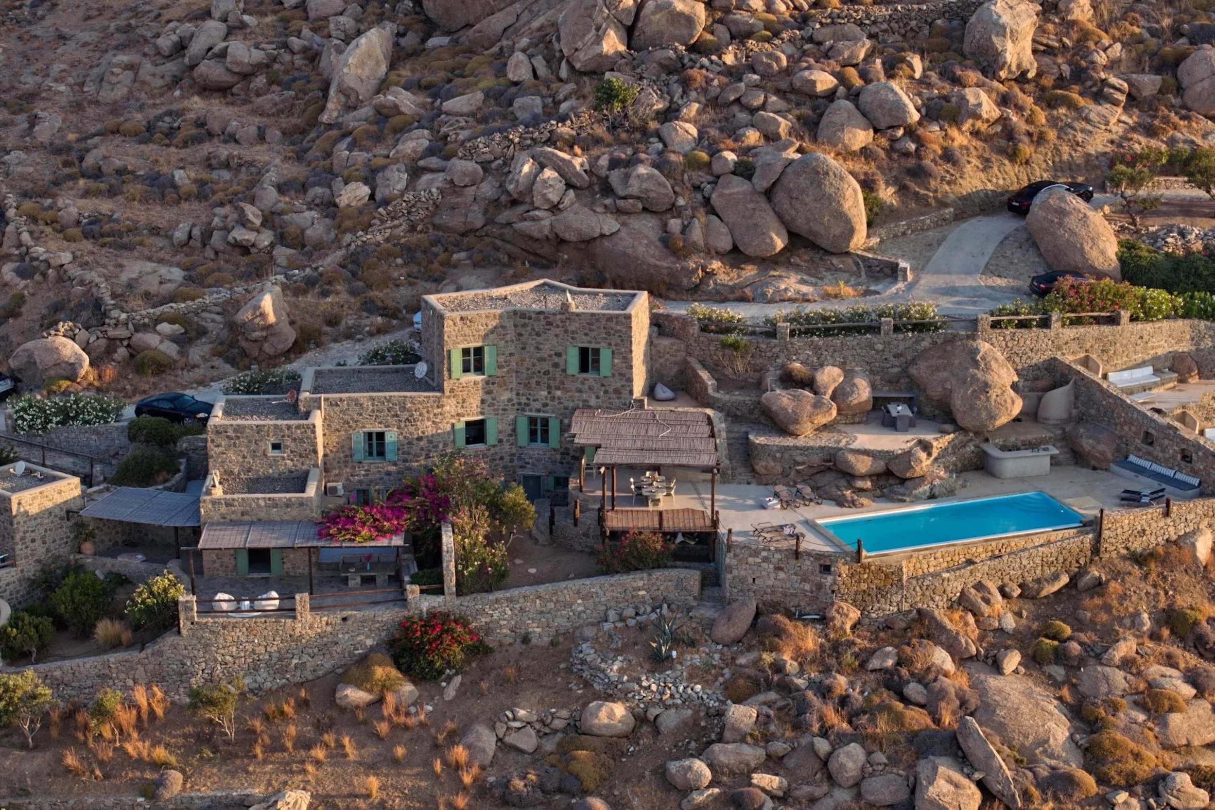
Ibiza, Spain | Spain Sotheby’s International Realty
Terracotta is indeed having another design moment, thanks to these historical reference points and modern applicability. “Light terracottas are soft and subtle, still brimming with warmth, and are a wonderful alternative to white if you’re looking for something cozy but not too colorful,” says Studholme. “They work in both contemporary and traditional homes, particularly when every surface and space is painted the same hue.”
Los Olivos, a sprawling equestrian estate in San Rafael, Ibiza, features the kind of traditional floors most people associate with terracotta and sun-drenched Mediterranean settings. “This color responds so well to light,” notes Studholme, adding that it somehow feels richer as day turns to night. Pairing it with rustic details like exposed-beam ceilings and wood paneling imbues the rooms with a welcoming, lived-in ambience.
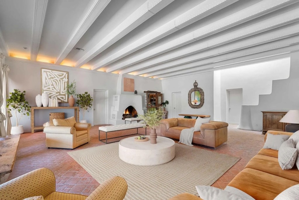
Patagonia, Arizona | Russ Lyon Sotheby’s International Realty
A contemporary ranch home in Patagonia, a scenic, rural town in Arizona, feels just as inviting with its terracotta interiors and exteriors. Studholme cautions against using darker versions of the color excessively, noting “its nuanced red-brown pigment can feel a little flat and muddy if underlit.” Nor is it suited to homes with cool lighting, she adds.
But here, peppering terracotta in little decor notes throughout makes the rooms feel extra comfortable, while the muted floor tiling pulls everything together.
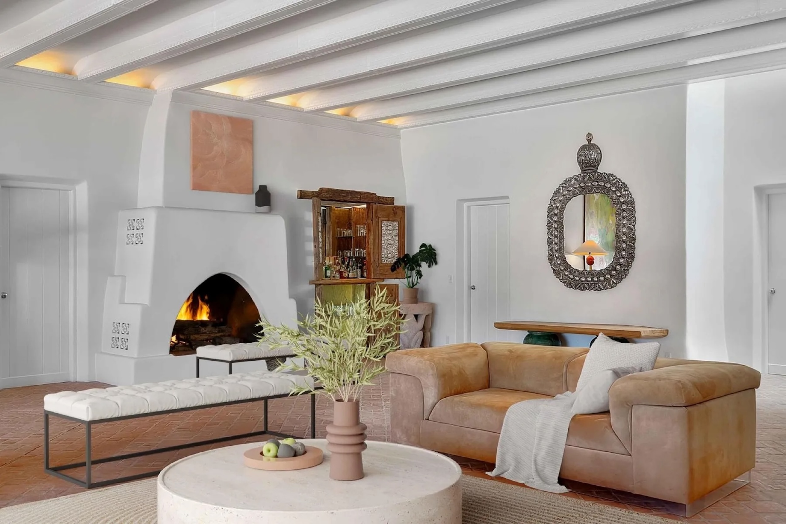
“Layering several shades of terracotta together creates a harmonious, seamless scheme that flows effortlessly,” says Studholme, as evidenced by a custom-built luxury residence in Santa Fe, New Mexico. Set in the exclusive Monte Sereno community, its interiors feel calm and pair well with the earthy palette outside.
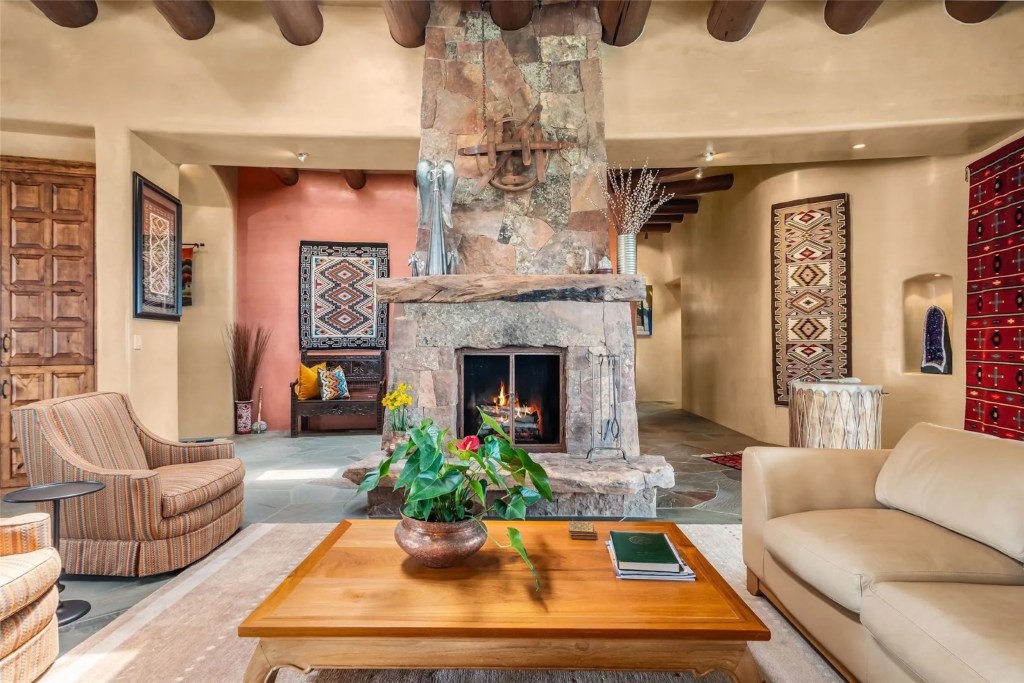
Santa Fe, New Mexico | Sotheby’s International Realty – Santa Fe – Main Downtown Brokerage
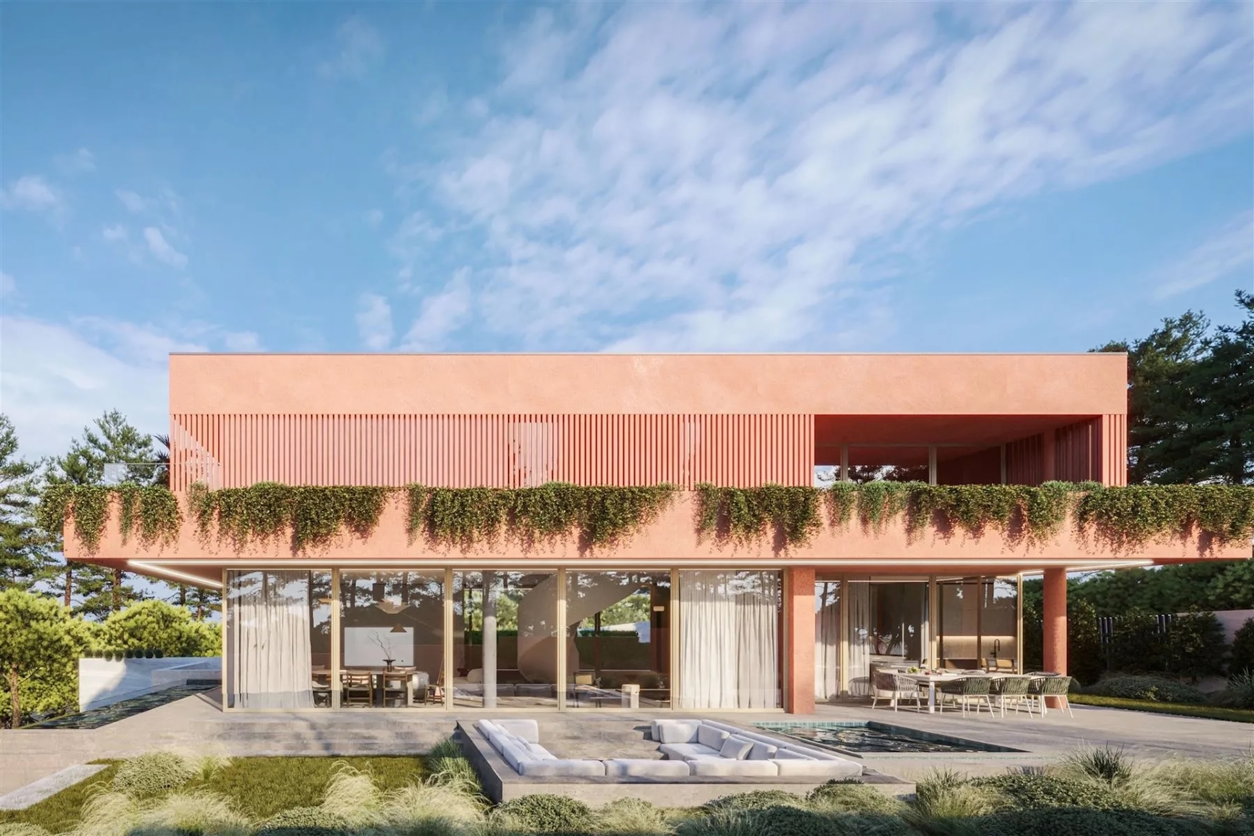
A new-build family home in Cascais, Portugal, a coastal resort just 20 miles west of Lisbon, combines the earthy hues of terracotta with the greens of nature: both the pine trees surrounding the property and the additional planting built into its design, with foliage tumbling from the upper terraces of the house itself. Large glass panels maximize the natural light, and all three floors are accessible by elevator.
On the other side of the Mediterranean, terracotta transforms some Moroccan homes into living postcards thanks to a skillful pairing with splashes of bright turquoise. From soaring arched ceilings to sizable tiles, with distinctive trellis-patterned borders, the color helps to create what Studholme calls a “jewel-like atmosphere.”
Further proof that a color “plucked from nature,” as Studholme puts it, was made for pairing with lush greens and warm neutrals.
Explore our Color Chart design series, from bold red, joyful pink, zingy orange and natural lilac to classic green, calming white, crowd-pleasing blue, versatile turquoise and uplifting yellow